Monday, August 31, 2020

Stock Market Update: End of August 2020

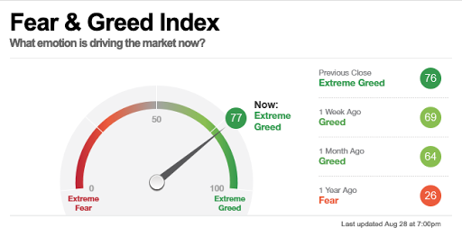
 The market continues to move up. CNN's Fear and Greed indicator is reading greed.


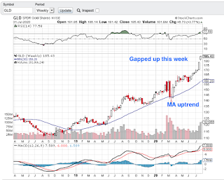
I find this chart I came up with to be interesting. The Gold ETF, GLD, compared to the DOW price action. If you notice, gold went up prior to the big market decline in 2009.  I circled the cross overs however you can see the price action diverged between the two when there was a change in the market. At the moment both are on an uptrend. In my opinion, if a COVID-19 vaccine comes out, then gold will probably drop, at least temporarily. It could continue to hold steady though as governments around the world print money and the dollar keeps losing value.


Sunday, August 23, 2020

Stock Market Update Week Ending Aug 21, 2020 - NYSE vs Dow Trend Chart

The market remains mixed as posted last week.

This week I want to look at a chart from Stan's book that used to be available on the Barron's site but they have since retired it so I make my own. It is the Dow vs. the NYSE Advance-Decline ratio.  We are looking for changes in trend. If both the Dow and NYSE A-D are going in the same direction or are they diverging?

In January they diverted and it turned out to be a signal of the drop. This week we see a potential divergence. What is important to note is that defensive stocks are in favor when the Dow moves up but the NYSE A-D moves down. We need to see if this continues as one week does not make a trend. 

This indicator should not be used on its own.


Stockcharts S&P shows the S&P began decline in February.

Sunday, August 16, 2020

Stock Market Update: Week Ending August 14, 2020

 From a stage analysis view, markets are in mixed territory. I rate 4 of the indicators as neutral. The DOW, global DOW and S&P are above their 30 week moving average line, but the MA is sloping down or flat. Not exactly a sign of strength.

One of my favorite Stan Weinstein charts is the NYSE High Low Differential which looks at the difference between the number of stocks hitting their 52 week highs and 52 week lows.  Each week I look at the number of new 52 week highs and the number of new 52 week lows. For example, this week we had 44 stock reaching new highs and 7 stocks reaching new lows. Not much action at all. In a strong recovery the numbers are more like 389 to 30 respectively. So while this indicator is in the green, it's not by much and the highs versus lows is not that broad.

Here is my chart. I have found that this one chart can give a pretty decent indicator of the overall market, even though it's a very simple chart.


Also keep in mind we are heading into an election plus COVID is not over yet so the market can get pretty choppy yet.


Sunday, August 2, 2020

Let's look at the Stan Weinstein indicators for the market as a whole.

Are the Indexes above their 30 week moving average?
  1. DJIA - Yes but the MA slope is down
  2. S&P - Yes with a flat MA
  3. NASDAQ - Yes with an upward MA
  4. GDOW - Yes but the MA slope is down

5. DJIA vs NYSE A-D Positive? Yes, the DOW is down while the NYSE is up.
6. DJIA vs NYSE 52 Wk High/Low? No, both are down
7. 200 Day MA NYSE A-D? Yes
8. NYSE 52 Week Highs vs Lows Differential? Yes
9. DOW price to dividend ratio? No, and personally I don't think this indicator works in our current market since the Fed stepped in after the 2009 market crash.

Essentially we have 6/8 positive, however 3 of the indexes are a very weak positive. The price might be above the moving average line, but the moving average is not on an uptrend for the DOW, S&P and Global DOW.

I am going to throw gold in as an contrarian indicator. It continues to be on a tear and that generally does not bode well for the overall market.