Sunday, October 25, 2020

Stock Market Update - October 23, 2020

Not much change in the stock market. It continues to hold steady. The Moving Average line on the global DOW is not slanting upward which is a positive sign.

With the election a couple of weeks away, Stock Chart's Three Takes on the Presidential Cycle article by David Keller is timely. Stan talks about presidential cycles in his book and I think Tom McClellan pretty much presents a similar viewpoint.

It's been awhile since we've looked at COVID-19. I am hoping the two charts below from the CDC provide some glimmer of hope. Cases are going up, but deaths are not.

 Total Cases


Total Deaths


Monday, October 5, 2020

Market Update: Oct 3, 2020

News that President Trump has contracted COVID-19 made headlines on Friday. He appears to be doing better as of this morning (WSJ).

It's possible the major indexes are in stage 3. Gold continues to be in Stage 2 but is showing signs of possibly moving into Stage 3 as well. Stimulus talks are in the works.

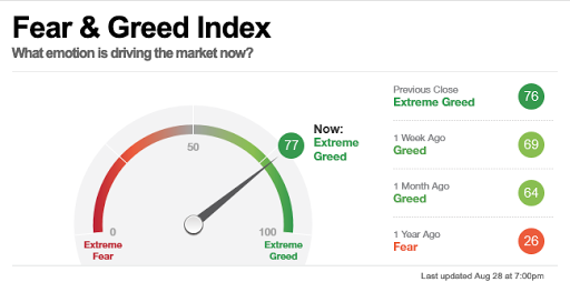
CNN's Fear & Greed went into greed last week. It's been in greed for awhile.

We will see.


Sunday, September 27, 2020

Stock Market Update: September 25, 2020

There is a lot of uncertainty in the air. We have the upcoming election, talks of fast tracking a COVID-19 vaccine, and in general malaise and people are sick and tired of the lock down. 

The major indexes are above their 30 week moving averages however they are not looking to be in good shape as evidenced by the S&P chart below.


Gold appears to be consolidating. Its moving average line is still sloping up however which is a positive indicator.

I am in a wait and see mode at the moment and expect some turbulence with the election.

Sunday, September 13, 2020

Stock Market Update: September 11, 2020

This week saw a little pull back however from a long view of weekly and monthly charts, the major indexes are still above their 30 week moving averages. Gold continues to be above it's moving average as well, but could be entering into Stage 3. 

The DOW shuffled the companies. Out are ExxonMobile, Raytheon and Pfiezer. In are Salesforce, Amgen and Honeywell. Also impacting the DOW is the Apple 4 for 1 stock split.

Holding steady for now.


Monday, August 31, 2020

Stock Market Update: End of August 2020

 The market continues to move up. CNN's Fear and Greed indicator is reading greed.


I find this chart I came up with to be interesting. The Gold ETF, GLD, compared to the DOW price action. If you notice, gold went up prior to the big market decline in 2009.  I circled the cross overs however you can see the price action diverged between the two when there was a change in the market. At the moment both are on an uptrend. In my opinion, if a COVID-19 vaccine comes out, then gold will probably drop, at least temporarily. It could continue to hold steady though as governments around the world print money and the dollar keeps losing value.


Sunday, August 23, 2020

Stock Market Update Week Ending Aug 21, 2020 - NYSE vs Dow Trend Chart

The market remains mixed as posted last week.

This week I want to look at a chart from Stan's book that used to be available on the Barron's site but they have since retired it so I make my own. It is the Dow vs. the NYSE Advance-Decline ratio.  We are looking for changes in trend. If both the Dow and NYSE A-D are going in the same direction or are they diverging?

In January they diverted and it turned out to be a signal of the drop. This week we see a potential divergence. What is important to note is that defensive stocks are in favor when the Dow moves up but the NYSE A-D moves down. We need to see if this continues as one week does not make a trend. 

This indicator should not be used on its own.


Stockcharts S&P shows the S&P began decline in February.

Sunday, August 16, 2020

Stock Market Update: Week Ending August 14, 2020

 From a stage analysis view, markets are in mixed territory. I rate 4 of the indicators as neutral. The DOW, global DOW and S&P are above their 30 week moving average line, but the MA is sloping down or flat. Not exactly a sign of strength.

One of my favorite Stan Weinstein charts is the NYSE High Low Differential which looks at the difference between the number of stocks hitting their 52 week highs and 52 week lows.  Each week I look at the number of new 52 week highs and the number of new 52 week lows. For example, this week we had 44 stock reaching new highs and 7 stocks reaching new lows. Not much action at all. In a strong recovery the numbers are more like 389 to 30 respectively. So while this indicator is in the green, it's not by much and the highs versus lows is not that broad.

Here is my chart. I have found that this one chart can give a pretty decent indicator of the overall market, even though it's a very simple chart.


Also keep in mind we are heading into an election plus COVID is not over yet so the market can get pretty choppy yet.